


About
This is a basic text element.
This is a basic text element.

The Problem
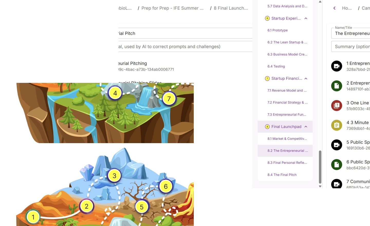
Initially our objective was to design how Generative UI would be presented for students when they are progressing through our courses. However our client asked us to change our focus to the teacher’s back end as it would focus on an area that needed some attention for UX design. The following issues were given to us when we were observing the site.
1. The site had a very utility style and functionality that would often stagnate first time users or current users who attempted to create new courses. this would lead to a preference of course duplication to avoid workflow obstacles.
2. Users felt they could not preview their courses actively as they were building the site which was causing further caution to the user’s course building.
3. Cambio’s intention was to build an AI system that was not implemented before, therefore our team was tasked to come up with a system thought process on how Generative UI would work.
1. The site had a very utility style and functionality that would often stagnate first time users or current users who attempted to create new courses. this would lead to a preference of course duplication to avoid workflow obstacles.
2. Users felt they could not preview their courses actively as they were building the site which was causing further caution to the user’s course building.
3. Cambio’s intention was to build an AI system that was not implemented before, therefore our team was tasked to come up with a system thought process on how Generative UI would work.
Initial Research
Competitor Analysis
To understand LMS’s (Learning Managements Systems) better, we had to look at current competitors who offered programs similar to Journey while also utilizing the latest in Generative AI/UI. We discovered that these competitors had already secured AI into their systems, which gave us the information we needed to complete the system for Journey.
Why heuristics analysis was left out
Because the nature of AI would change the website as a whole, there was little very little incentive to perform heuristics on the Journey platform due to constant revisions of the UI that would be demanded from users. There was however some issues that needed to be solved such as the accessibility and the pain points course creators had for the back-end.

Who is the user
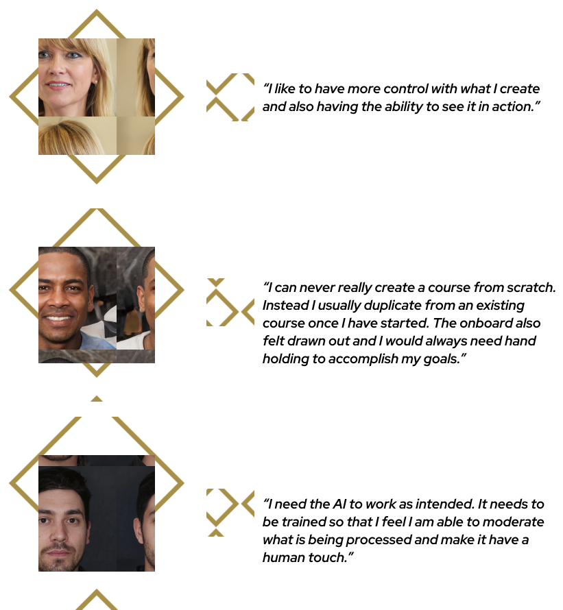
Although our directive was to focus on existing Journey users, we had to also devise how new users would interact when they first join the platform. This was also part of the feedback in our initial user interviews when course creators had to recall what their pain points were. Additionally, our observations of the platform combined with the competitor analysis would tell us that there were some changes that needed to be made for Journey itself.
Testing and design
User flows
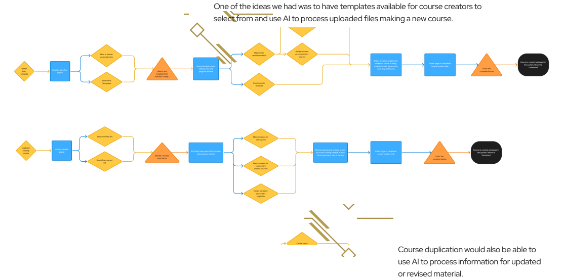
After gathering our user data we made planned the appropriate workflows that users would take in order to accomplish their goals in Journey. We took in what teachers wanted from the platform and added in our own thoughts for how course creation would work in Manual and AI contexts. What we came up with were systems designed for user control first and AI processing as an option in every step. Additionally, we centered an idea of having two modes the user can choose with either having a Manual mode or using AI mode when creating the entire course structure.
Testing our Prototype
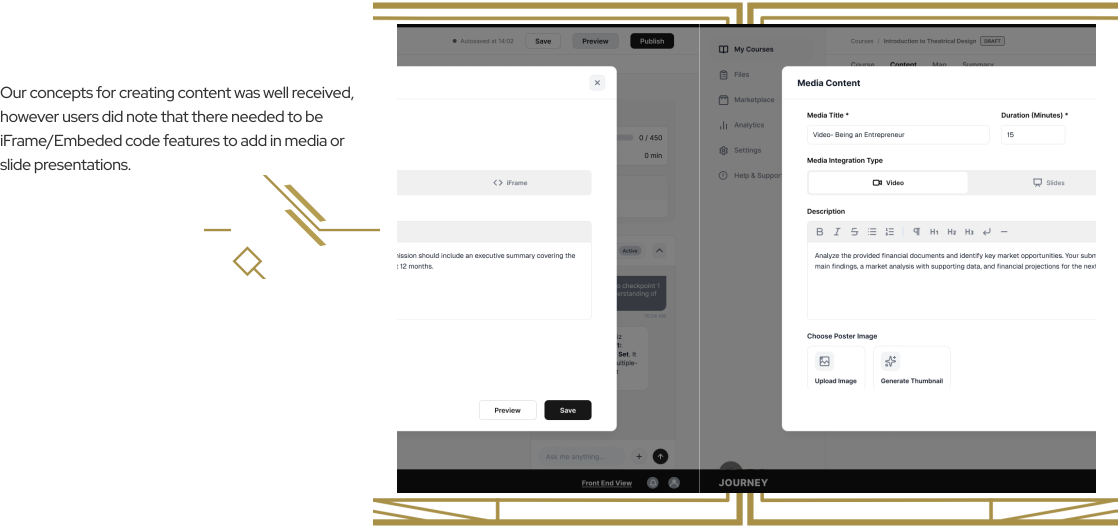
After giving updates to our client and confirming where to direct the focus, we developed 3 user flow prototypes that would show users the ideas we had in mind for Journey improvements. Moderating the user testing remotely, we were able to get valuable feed back from a mix of current users and new users to test our idea of manual mode, AI mode, and course duplication.


AI and tech stack
AI had to be researched and understood as to how it would fit into the current system of Journey both front and back end. This would help our task in providing the client their initial request on student facing generative UI which was prior to switching to teachers, and helping give our system thinking on the back end as well in our complete design recommendation.

High Fidelity
AI had to be researched and understood as to how it would fit into the current system of Journey both front and back end. This would help our task in providing the client their initial request on student facing generative UI which was prior to switching to teachers, and helping give our system thinking on the back end as well in our complete design recommendation.
Dark Mode

Why dark mode?
Since the website appearance was white and static, we wanted to bring a dark mode that had more dynamic elements, colors, and typography. This gave us the challenge of taking on a new form of visual aesthetics that followed different rules to the light mode counterpart that is usually posted on all websites. Additionally we have given the users a chance to edit their accessibility preferences along each page of the website or ask their AI chat to revise the dashboard to their liking.
A mobile future for students
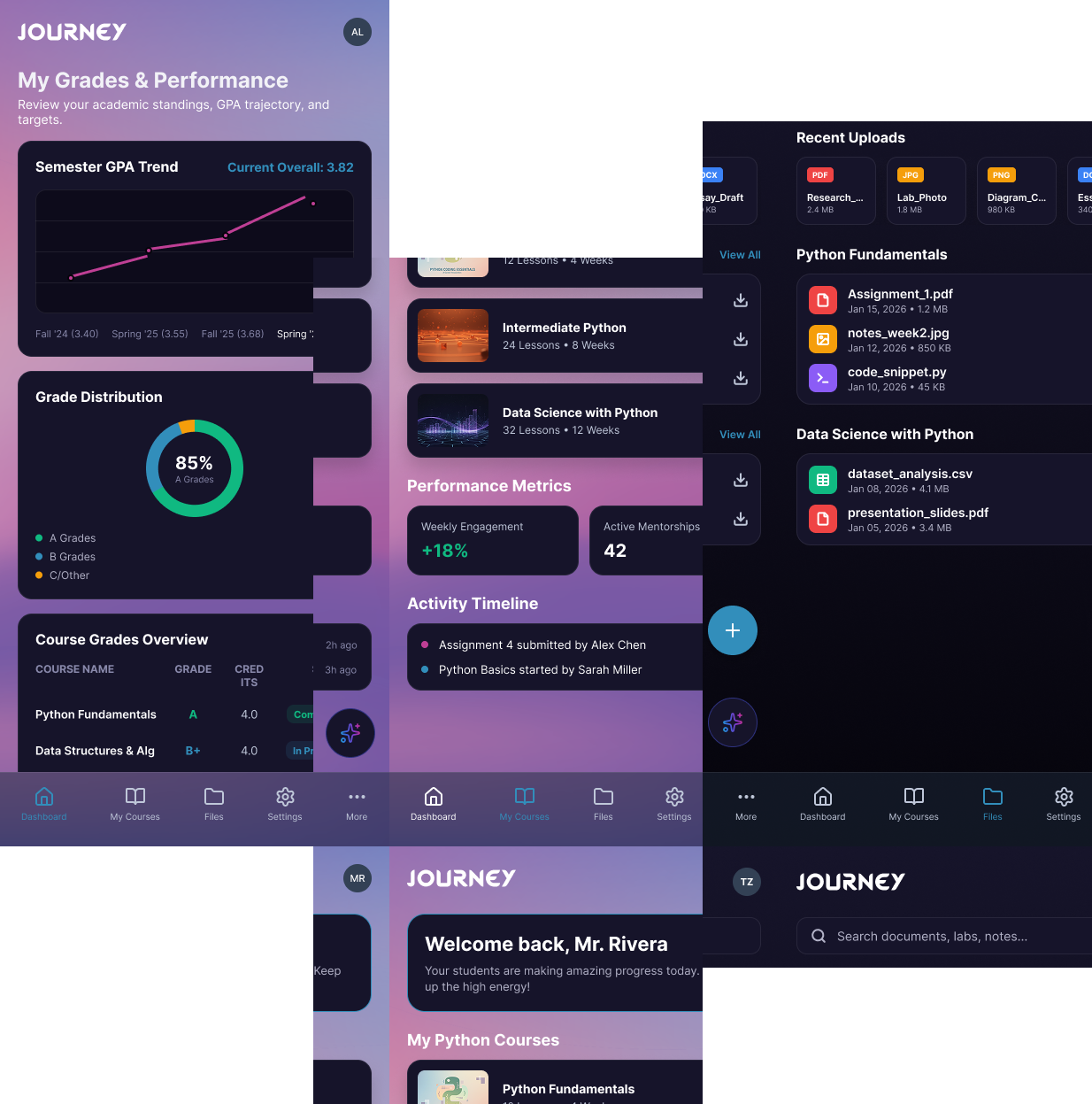
To enable a mobile version of the Journey platform, Flutter Gen UI would be used to render and maintain a mobile version. Students would be able to check on their status, apply for courses, continue their progress, and modify the UI to what they need, with the appropriate UI boundaries.
Cambio roadmap
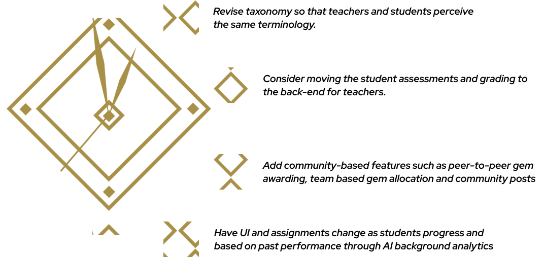
The roadmap for Journey will be to implement the back-end course creator features from our design recommendations in the coming months. Following that, we provided our future feature recommendations to apply for both students and teachers.
Next steps
Cambio will continue to implement and test the generative UI by adding in agents to verify that journey is ready for both students and teachers. Additionally, our teacher’s design suggestions will be looked at and applied to the back-end site in the coming months.